Introduction to Passages Malibu
Passages Malibu is a special place for people who need help with addiction. It’s a luxury treatment centre in Malibu, California. The centre is on a big 10-acre property, surrounded by peaceful hills and views of the Pacific Ocean. The calm and beautiful setting makes it easier for people to focus on getting better.
What makes Passages Malibu stand out is how it treats addiction. Instead of using a traditional plan, they take a non-12-step, holistic approach. This means they don’t see addiction as something people are stuck with forever. Instead, they work to find the real reasons behind the addiction. This way, every person gets a plan that fits their needs and not just a one-size-fits-all solution.
How Passages Malibu Helps People Recover
Passages Malibu believes that addiction comes from deeper problems, like stress, pain, or trauma. They help people by working on these root causes. This is different from other programs that might focus on saying you’re powerless against addiction. Passages believe that people can take back control of their lives.
Here are some of the ways they help:
- Therapy sessions: People meet with a counsellor one-on-one to talk about their feelings and challenges. This helps uncover what caused the addiction.
- Alternative treatments: These include things like yoga, meditation, acupuncture, and massage therapy. These practices help relax the mind and body while supporting recovery.
- Healthy eating: Nutrition is a big part of healing. Eating good, healthy meals helps the body stay strong and recover faster.
- Personalized care: Each person gets a treatment plan made just for them. This makes sure they get the right kind of help they need.
Passages Malibu also teaches people how to take better care of their emotional and physical health. This focus on the whole person—mind, body, and spirit—is why it’s called a holistic approach.
Why Branding Matters for Luxury Rehab Centers
Branding is really important for places like Passages Malibu. It’s how people know what the centre stands for and what it promises to offer. For a luxury rehab centre, the brand tells people they’ll get high-quality care and privacy.
At Passages Malibu, branding starts with their logo and design. The logo often includes calming images, like ocean waves or nature scenes. These symbols match what the centre is all about—peace, healing, and comfort.
The way Passages talks about its work also builds trust. They focus on their success stories and the innovative ways they treat addiction. Many clients have shared glowing reviews, which makes the centre even more respected.
When people choose a luxury rehab, they want a place they can trust. A strong brand helps Passages show that they are one of the best options. Their name is not just well-known but also trusted worldwide for offering excellent care in a beautiful and private setting.
The History Behind Passages Malibu
Founding by Chris and Pax Prentiss in 2001
Passages Malibu started in 2001 when Chris Prentiss and his son, Pax Prentiss, decided to help people struggling with addiction. Pax had a very hard time with drugs and alcohol. He used heroin, and cocaine, and drank heavily. His life was in danger, and he felt hopeless. But his father, Chris, didn’t give up on him.
Chris realized that most addiction programs at the time were not working for Pax. So, he worked to create a new way to help him. They found that addiction wasn’t just about drinking or using drugs—it was about deeper problems. Maybe someone had gone through something painful in the past, or maybe they were dealing with stress or depression. Chris and Pax decided to build a program that helped people find and heal the reasons behind their addiction.
Their idea was different from most other rehabs. They didn’t believe in calling people “addicts” or forcing them to go through steps like the 12-step program. Instead, they wanted to give people hope and teach them they could recover fully. This idea became the heart of Passages Malibu.
The Journey of Passages Malibu
Passages Malibu is not like other rehab centres. It is in Malibu, California, and sits on 10 beautiful acres overlooking the Pacific Ocean. Imagine waking up every day to the sound of waves and seeing the ocean—it’s peaceful and relaxing, the perfect place to heal.

When Passages first opened, it was just one centre. But it quickly became known for doing things differently. Instead of giving everyone the same treatment, Passages created special plans for each person. They looked at the person’s life and health to understand why they were using drugs or alcohol. Maybe they had trauma, anxiety, or health problems that needed care. Passages focused on healing those problems, so people didn’t feel the need to use drugs or alcohol anymore.
Because of this special care, many people started choosing Passages Malibu. Celebrities, business owners, and others came here to get help. They liked that Passages treated them with respect and gave them a safe, private place to recover. Passages became famous for helping people find lasting solutions to addiction.
The Role of Branding in Establishing a Global Identity
When you think of Passages Malibu, you might picture its logo—a simple yet elegant design. The logo reflects the centre’s focus on healing and peace. It also shows the high level of care and quality you can expect at Passages.
Passages worked hard to let people know about its special approach to addiction treatment. Through ads and online posts, it shared stories of how it was helping people recover. It became known as one of the best rehab centres in the world.
The centre didn’t just rely on ads, though. It also built trust by staying true to its mission. Passages didn’t make empty promises; they focused on results. That’s why it has remained a top choice for people who want real help with addiction.
Passages Malibu shows what’s possible when you combine care, innovation, and a strong belief that people can change their lives for the better. It all started with a father and son’s hope—and has grown into a place where people from all over the world come to heal.
Design and Meaning of the Passages Malibu Logo
Visual Elements of the Logo
The Passages Malibu logo is designed to be simple yet very elegant. It uses colours, shapes, and text that all come together to tell a story of peace and healing. The colours in the logo are soft blues and greens. These colours aren’t just pretty to look at—they make you feel calm and at ease. That’s important because Passages Malibu is all about helping people find peace during tough times.
The text in the logo is written in a modern, clean font. This makes it look professional and easy to read. When you see the logo, it feels fancy but not too much—it’s just the right balance. The smooth lines and the way everything is arranged show care and thought. It’s not just a logo; it’s a promise of high-quality care and attention to detail.
Symbolism in the Logo
Every part of the Passages Malibu logo has a deeper meaning. It’s not just about looking nice; it’s about what the design stands for. Many times, logos include shapes or symbols. In this case, the logo might have round or flowing lines. These could remind people of waves or the flow of life. Waves symbolize change and new beginnings, which fits perfectly with the idea of recovery.
The soft curves also represent a journey that goes full circle. Recovery is not always a straight line, and this idea is shown in the logo. If there are natural elements, like leaves or water shapes, they might show a connection to nature. Passages Malibu believes in healing the whole person—mind, body, and soul—and the logo reflects that idea. It connects with people emotionally because it shows growth, renewal, and hope.
Evolution of the Logo
The Passages Malibu logo hasn’t always stayed the same. Over time, it has been updated to keep it fresh and modern. However, the changes have been small because the main idea of the logo is very strong. Keeping the basic design the same helps people recognize it right away. A few updates, like brighter shades of blue or changes in the font, make it look newer but still familiar.
This slow change in the logo shows how Passages Malibu has grown as a centre. When the centre started, it was just one place helping people. Now, it’s known all over the world for its luxury and care. The changes in the logo match the success and growth of the centre itself. These updates show that Passages Malibu is always improving while staying true to its mission of helping people heal.
Brand Identity and Logo Significance

How the Logo Enhances Brand Recognition
Logos are more than just pictures; they’re the face of a brand. For Passages Malibu, their logo plays a huge role in helping people remember them. A well-crafted logo sticks in the minds of viewers, making it easier for them to recognize the centre whenever they see it.
When people search for luxury addiction treatment, they often come across Passages Malibu’s logo on their website, brochures, and ads. This consistency is key. Every time the logo is used, it reinforces the idea of quality care and holistic healing. It’s like a stamp of trust that tells people they’re in the right place.
Additionally, the Passages Malibu logo helps set it apart from other rehab centres. With so many options out there, having a unique and recognizable design gives Passages Malibu an edge. Whether it’s on a billboard overlooking the highway or a digital ad popping up online, the logo is a constant reminder of their world-class services.
The Logo is a Symbol of Trust
For someone dealing with addiction, trust is everything. The Passages Malibu logo goes beyond being a simple design—it’s a symbol of hope and reliability. Many clients say they were drawn to the centre because the branding made them feel calm and confident in their decision.
Psychologists often talk about how visuals, like logos, affect emotions. Passages Malibu’s logo uses soft, inviting colours and clean lines, creating a sense of safety and care. This subtle message reassures clients and their families that they’re turning to a reputable place for help.
Moreover, testimonials often mention how Passages Malibu feels like a safe space. Clients recall how seeing the logo on welcoming brochures, elegant facility signs, and online pages solidified their decision to seek treatment there. This emotional connection makes the logo a powerful tool for building trust.
Across every interaction—whether it’s online research, walking into the facility, or calling for information—the logo stands as a visual promise of quality, care, and healing.
Holistic Healing and Branding: A Perfect Match
Passages Malibu is a special place that combines luxury and healing to help people recover from addiction. The way they do this is reflected in their branding, especially in their logo. The logo is not just a picture. It shows the care, healing, and safe place that Passages Malibu offers. Everything about the logo and the way the centre is set up connects to the idea of healing the mind, body, and spirit.
How Passages Malibu Combines Luxury and Holistic Care
Passages Malibu is not just another place for addiction treatment. It’s a place where people can heal in a peaceful, beautiful environment. The centre does not follow the usual 12-step program that many other rehab centres use. Instead, it focuses on a holistic approach, meaning it looks at all parts of a person’s life when treating addiction. This means that the treatment at Passages Malibu helps the mind, body, and spirit heal together.
The centre is located in Malibu, California, where it has a private space with a stunning view of the Pacific Ocean. People who come to Passages Malibu can enjoy private rooms, delicious meals, and relaxing spa services. This luxury setting helps people feel calm and cared for, making it easier for them to focus on their healing journey. With all these special features, Passages Malibu stands out from other rehab centres that may not offer the same level of care or luxury.
The Role of the Logo in Reflecting These Principles
The logo of Passages Malibu is more than just a symbol. It represents the values and the kind of care the centre offers. The design is simple, yet elegant. The colours used in the logo are soft, showing a calm and peaceful feeling. This matches the idea of healing and relaxation that Passages Malibu is known for. Sometimes, the logo even includes images of nature, like leaves or waves, which are symbols of growth and change—important parts of the holistic approach at Passages Malibu.
The logo also helps show the idea of change and transformation, which is very important in addiction recovery. People who come to Passages Malibu are looking to make a positive change in their lives, and the logo helps them feel that hope. It’s not just a logo—it’s a reminder that recovery is possible, and it’s a sign of strength and renewal.
Comparisons with Logos from Other Rehab Centers
Many rehab centres also use logos to show their values, but not all of them do it as well as Passages Malibu. Each centre has its own way of showing what it believes in, and looking at its logos can tell us a lot about what kind of treatment it offers.
- Promises Treatment Centers: The logo for Promises Treatment Centers uses a picture of a tree to show growth. The colours are earth tones, making the logo feel warm and natural. But it doesn’t have the luxury feel that Passages Malibu has. It focuses more on nature than the luxury and care you feel at Passages Malibu.
- Cliffside Malibu: This rehab centre has a logo with ocean themes, showing the calm and peaceful setting of Malibu. The design is simple and clean. While it suggests a peaceful atmosphere, it doesn’t focus as much on transformation or holistic care, as the Passages Malibu logo does.
- The Clearing: The Clearing uses a logo with bright colours and abstract shapes. The design shows a sense of renewal, which is a key part of recovery. But, unlike Passages Malibu, the logo is more modern and less focused on the calming, luxurious environment that helps people heal.
Passages Malibu’s logo stands out because it does more than just show what the centre does. It shares the feeling of luxury, peace, and growth. The combination of these elements in their logo helps create a brand that people can trust when looking for a place to heal from addiction.
Passages Malibu Logo: Symbol of Healing and Transformation
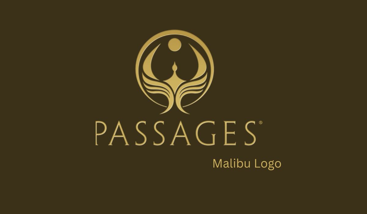
The Passages Malibu logo is more than just a picture—it tells a story. It shows what the centre stands for and what people can expect when they come for help. Passages Malibu is a place where people go to heal from addiction. The logo is simple and easy to recognize. It uses soft colours and clean lines that help people feel calm and peaceful. These are the same feelings that the centre wants to give to those who stay there. It’s a place where people feel safe and can work on their healing in a comfortable and welcoming environment.
The Passages Malibu logo stands for more than just the centre—it represents the journey people take when they come to Passages. Getting better is not easy, but with the right care, support, and understanding, people can overcome their struggles. The logo reminds clients that healing is possible. Just like the centre itself, the logo brings a sense of hope, showing that recovery can happen in a beautiful place where people are cared for in a way that meets their needs.
Passages Malibu Logo in Popular Media
You can see the Passages Malibu logo in many places. It shows up on TV ads, digital platforms, and social media. This helps more people learn about Passages Malibu and the great help it offers for addiction recovery. Seeing the logo in ads or on websites helps to remind people that this is a trusted place for recovery. When people see the logo, they think of the relaxing atmosphere and the expert care they can get when they come to the centre.

In TV commercials and online ads, the Passages Malibu logo is often shown with pictures of the beautiful Malibu coast and the peaceful surroundings. The ads show how people get personal care and support from trained professionals who help them get better in a way that feels safe and comfortable. The logo is simple, but it tells people that they can trust Passages Malibu to help them find healing.
The Passages Malibu logo helps to build trust with the public. When people see it, they know that the centre cares about them and their recovery. They know it is a place that is serious about helping people, and this can make them feel more confident in choosing Passages Malibu for treatment.
Why Branding Matters for Rehab Centers
Branding is very important for places like Passages Malibu because it helps to show what the centre is about. In the addiction treatment field, people want to make sure they choose the right place for help. The Passages Malibu logo is part of that process. A good logo tells people what the centre stands for and helps them feel comfortable.
A strong logo, like the Passages Malibu logo, helps to build trust. When people are looking for help with addiction, they want to know they are going to a place that is serious and professional. They want to feel that the staff at the centre understands them and knows how to help. The logo shows that Passages Malibu is a place that offers not just good care, but the best care. It helps people feel safe and confident that they will get the help they need.
Branding is important because it helps a rehab centre stand out. There are many places where people can go for addiction treatment, so having a strong logo helps make Passages Malibu different from other centres. It helps people see that this is a special place where they can get help in a way that works for them. Whether it’s in ads or on the centre’s website, the Passages Malibu logo is always there to show people that this is a place where they can find hope and start their recovery journey.
When a rehab centre has good branding, like the Passages Malibu logo, it shows that it cares about its clients and the work they do. A well-designed logo is just one way that Passages Malibu shows it is a leader in addiction treatment. It helps to make the centre feel professional, trustworthy and focused on helping people heal.
Conclusion
The Passages Malibu logo is much more than just a picture. It is a symbol that stands for hope and healing. This logo shows that Passages Malibu is a place where people can get better. It tells people that the centre is there to help them through difficult times and support them on their way to recovery. When people see the logo in TV commercials or online, they know that Passages Malibu is a place where they can trust the staff to take good care of them. The simple design of the logo makes it easy for people to remember, and it shows that the centre cares about its clients. Branding like this is important because it helps build trust. For people who are going through hard times, seeing a symbol they can trust makes them feel safer and more confident in the decision to get help. The Passages Malibu logo plays a big part in making sure people know they are in good hands.
FAQS
What does the Passages Malibu logo symbolize?
The Passages Malibu logo represents hope, healing, and a new beginning. It stands for the care and support that Passages Malibu offers to people who want to recover from addiction. The simple and clear design of the logo shows that a centre is a place where people can feel safe and trusted. It helps people understand that they are starting a new chapter in their lives and that Passages Malibu is there to help them on that journey.
Has the Passages Malibu logo changed over time?
No, the Passages Malibu logo has stayed the same for many years. Keeping the logo the same helps people recognize it and remember the centre. The simplicity of the logo makes it easy for people to see that Passages Malibu is a reliable and trustworthy place. By keeping the logo unchanged, Passages Malibu shows that it is a place of stability and care for those who are looking for help.
Why is branding important for addiction recovery centres?
Branding is very important for addiction recovery centres because it helps people trust the centre. When people are looking for help, they want to know that they are choosing the right place. A strong brand, like the Passages Malibu logo, helps people feel confident that they will get the care and support they need. It shows that the centre is professional, reliable, and focused on helping people get better. A good brand helps a centre stand out and makes it easier for people to decide to seek help.
How does the Passages Malibu logo help attract potential clients?
The Passages Malibu logo helps attract potential clients by showing them that they can trust the centre. The simple design of the logo makes it easy to remember, and it helps people feel safe when they see it. The logo is often used in TV ads and on websites, which helps more people learn about the centre. When people see the logo, they know that they are looking at a place where they can get the support they need to start their recovery. The logo helps people feel more comfortable and confident about their choice to get help at Passages Malibu.
For More More Visit: Creative Blogs
